WINDHOVER
Marketing Design
Social Media Posts
Print Promotions
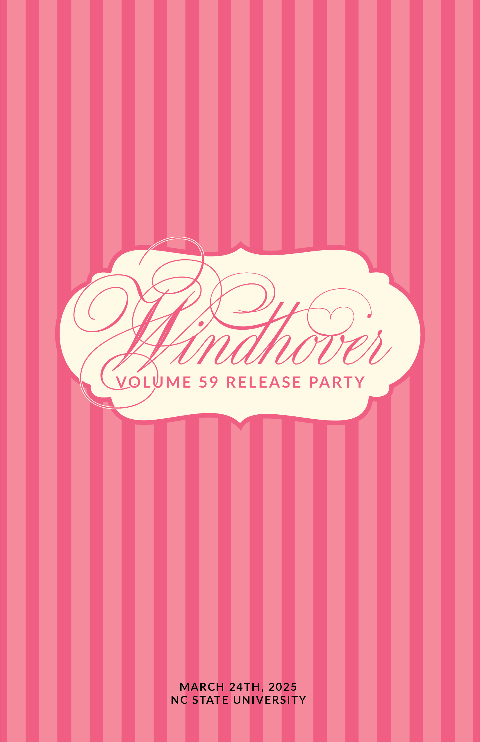
Windhover is NC State's Literary and Arts Magazine, publishing art and literature by NC State students, alumni, and surrounding community. Windhover releases a volume every Spring, each volume having a different look and feel. I was Windhover's promotions designer for their 59th volume.
Volume 59's volume featured script typeface, pastel colors, and delicate patterns. Working with the design editor, I created a number of print and digital materials, as well as merchandise to promote the new volume while adhering to the book's style guide. These were featured in newsletters, social media posts, or printed around campus.


MAZARAKATA
UX/UI
Information Design
Visual Identity
Mazarakata is the name of a Mycenaean burial site located on the island of Kefalonia, Greece. I worked on a team during a study abroad program to explore the intersection of history, culture, technology, and design. We were tasked by Kefalonia's Ministry of Arts and Culture to create an interactive 3D experience to preserve the site, as well as a interface to make the site's history accessible to the public.
We didn't want to merely create a 3D scan of the site, but create an experience of "uncovering," inviting the public to be a part of the act of discovery. We also wanted this to be a living archive for the public to access historical information, with the possibility for more ancient sites on the island to be added.
WINDHOVER
Marketing Design
Social Media Posts
Print Promotions
Windhover is NC State's Literary and Arts Magazine, publishing art and literature by NC State students, alumni, and surrounding community. Windhover releases a volume every Spring, each volume having a different look and feel. I was Windhover's promotions designer for their 59th volume.
Volume 59's volume featured script typeface, pastel colors, and delicate patterns. Working with the design editor, I created a number of print and digital materials, as well as merchandise to promote the new volume while adhering to the book's style guide. These were featured in newsletters, social media posts, or printed around campus.


MAZARAKATA
Research
Process
Our project began with visiting the Mazarakata site, sketching its surroundings, and taking test scans. This gave us insight into the scale of the physical space, its location, and topography. This also led us to look into the site's archeological history, cultural significance, and its impact on the local community.
In addition to talking to local scholars and researches about the site's history, we were given access to archived documents about the history of the site's archeology and discovery. This information inspired us to not just preserve the site, but create a digital space for the public to explore and learn about its discovery. The artefacts in these documents informed our visual creative direction for the site.
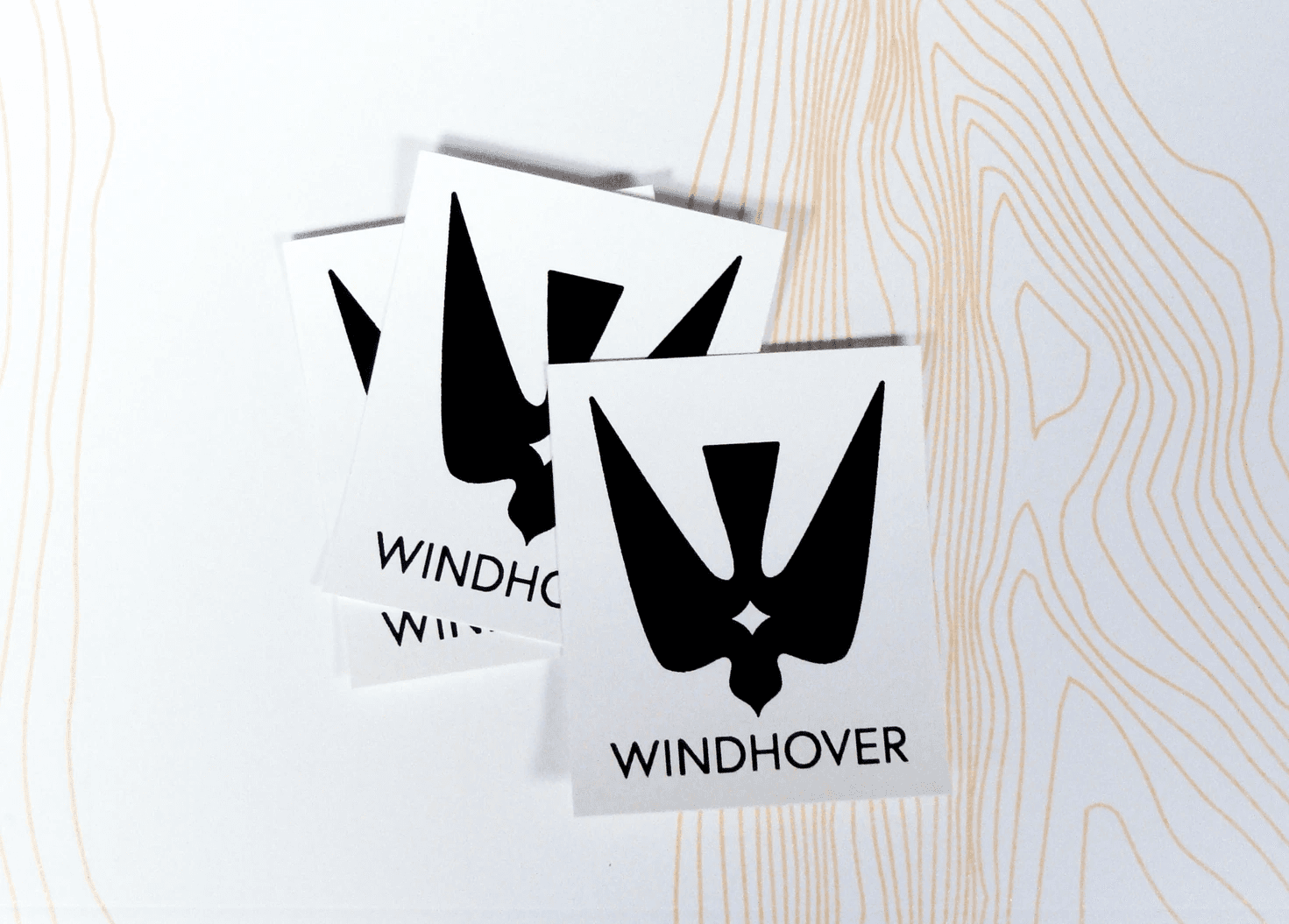
WINDHOVER
Logo
Brand Identity
In past years, Windhover would adopt a new visual direction for every volume, including new logo, colors, and typeface. While we still wanted to keep the tradition of a new look for the book each year, we decided to create a consistent logo and brand for the publication that would remain the same through publication cycles. I had the honor of making Windhover's new permanent logo, depicting a kestral, the bird that inspired Windhover's name.